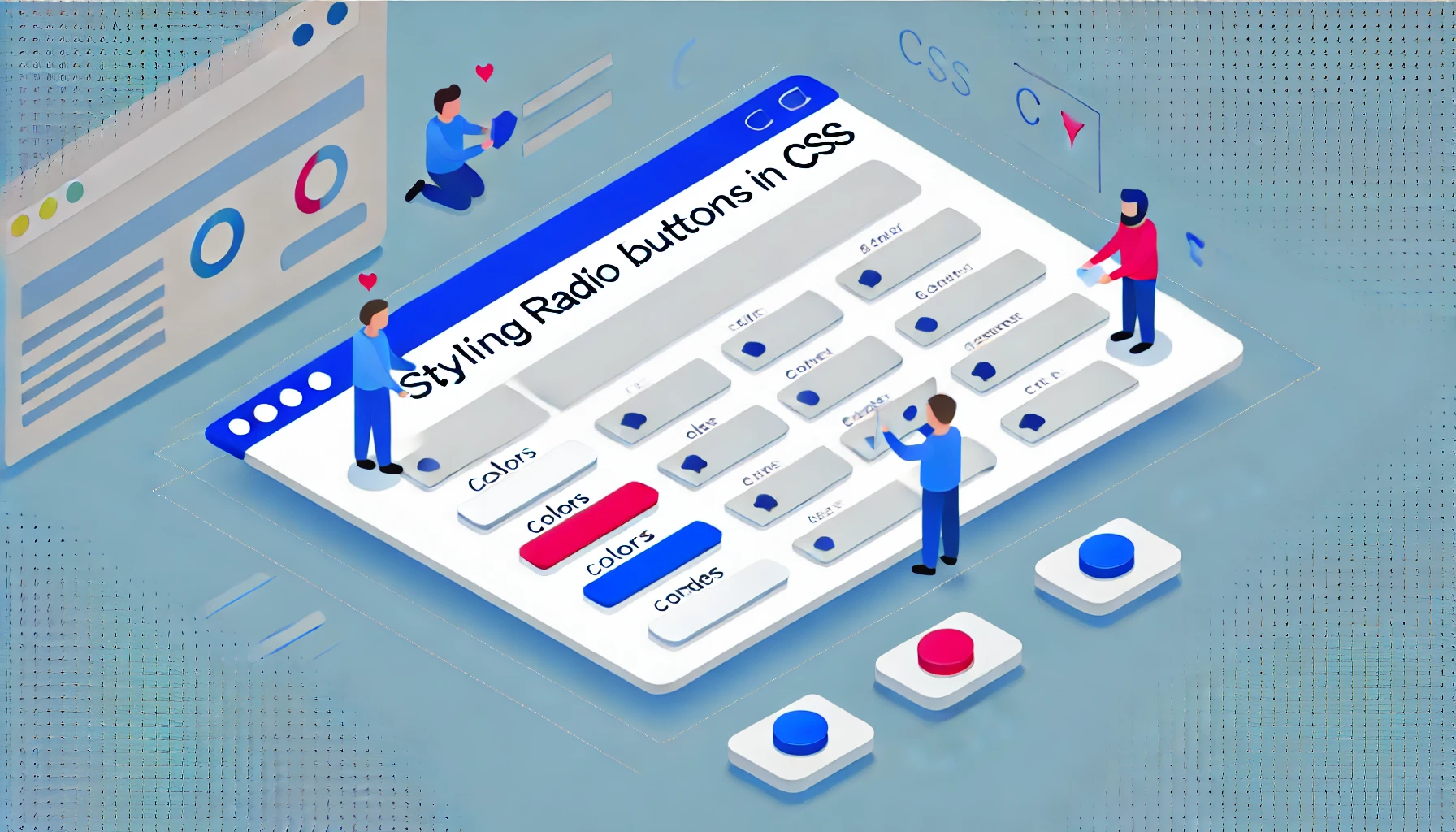
Radio buttons are an important element of user interfaces in web forms, allowing users to make a single choice from several options. However, the default appearance of radio buttons provided by browsers often fails to meet the visual standards of modern web design. Developers frequently face the challenge of styling these elements, which can be complicated by differences in how browsers render form controls.
Disabling Default Styles
The first step toward customizing radio buttons is to reset the default styles using the CSS property appearance: none;, which is supported by most modern browsers. This property removes all built-in styling, allowing developers to redefine the element’s appearance entirely.
.form-radio {
appearance: none;
-webkit-appearance: none; /* For Safari and Chrome */
-moz-appearance: none; /* For Firefox */
/* Define your own custom styles here */
}
Hiding the Default Radio Buttons
Sometimes, it’s more effective to use a nonstandard approach — by hiding the <input> element and creating a visual equivalent using other HTML elements, such as <span>. This approach gives developers full freedom to design custom visuals:
<label for="radio-1" class="form-radio-hidden">
<input type="radio" name="demo" value="1" id="radio-1">
<span class="radio"></span>
<span class="text">Option 1</span>
</label>
Compatibility Issues and Solutions
Despite wide support, the appearance property doesn’t work in older versions of Internet Explorer and Edge. Developers may need to use polyfills or conditional comments to ensure compatibility with outdated browsers:
<!--[if IE]>
Special styles for Internet Explorer
<![endif]-->
Detailed Styling
After defining the base styles, you can add visual effects for different radio-button states such as hover (:hover) or selected (:checked):
.form-radio-hidden .radio {
// Base styles for pseudo-radio buttons
}
.form-radio-hidden:hover .radio {
// Styles on hover
}
.form-radio-hidden input:checked + .radio {
// Styles for the checked state
}
Adding Animations
To improve visual responsiveness, you can include CSS transitions or animations that make interactive elements more engaging and pleasant to use:
.form-radio-hidden .radio {
transition: background-color 0.3s, box-shadow 0.3s;
}
Practical Tips
-
Testing: Always test your customized radio buttons across multiple browsers and devices to ensure proper functionality.
-
Accessibility: Make sure your custom radio buttons are accessible to users with disabilities by using proper ARIA attributes.
-
Responsiveness: Adjust sizes and spacing of controls depending on the user’s device to ensure comfortable use on mobile screens.
Conclusion
Customizing radio buttons can significantly enhance the user experience by making interfaces more visually appealing and intuitive. Understanding the nuances of CSS and HTML will help you create truly unique and functional form controls that blend seamlessly into your website’s design.